Angular 4.0 major version was released exactly two months back (i.e, March 2017) by following the semantic versioning process. Thereafter many minor releases came out and will continue till the next major release 5.0 which will expected to release on Sept 2017. PrimeNG releases also in-synch with the Angular major releases. PrimeNG 4.0 was released immediately(First week of May 2017) with 100+ improvements which includes new components, features, defect fixes and accessibility support for keyboard and screen readers. PrimeNG development is quite active and rapid, due to this nature there will be another major release with +60-80 improvements in the couple of days.
PrimeNG 4.1 release going to ship with new components, new features, defect fixes, performance improvements on accessibility support for keyboard and screen readers. To make the community users aware about all changes in one place there is a detailed Github project available here.
What are the new components?
The newer version brings two new components such as ColorPicker and Organization chart components.
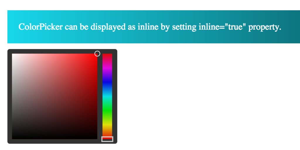
ColorPicker: ColorPicker is an input component to select a color in different formats (use type property with “hex”, “rgb” and “hsb” values). You can also define the component either in inline or overlay mode.
<p-colorPicker name="inline" [(ngModel)]="color2" inline="true"></p-colorPicker>
The inline mode of color picker would appear as below,
You can also define color picker in overlay mode, different formats along with interactive change event callback.
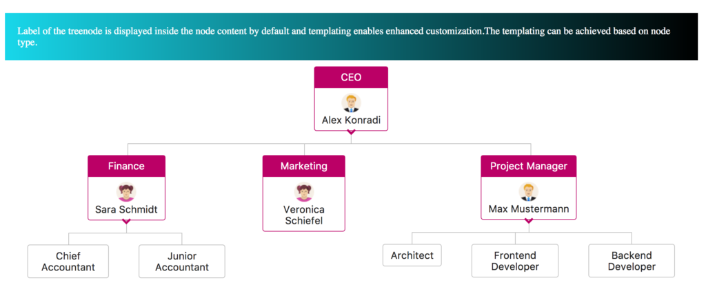
OrganizationChart: OrganizationChart visualized as hierarchical organization data. Even though it sounds like a part of charts section, it will be considered as data component due to it’s data model nature. This component brings expand/collapse state, selection and customization through templating features.
We can create the powerful organization chart for any kind of organization
<p-organizationChart [value]="dataAdvanced" styleClass="company">
  <ng-template let-node pTemplate="department">
    <div class="node-header ui-corner-top">
      {{node.label}}
    </div>
    <div class="node-content ui-corner-bottom">
      <img src="/assets/data/avatar/{{node.data.avatar}}" width="32">
      <div>{{node.data.name}}</div>
    </div>
  </ng-template>
  <ng-template let-node pTemplate="default">
    {{node.label}}
  </ng-template>
</p-organizationChart>
The component class need to define TreeNode API data model just similar to Tree,TreeTable components
this.dataAdvanced = [
  {
    label: 'CEO',
    expanded: true,
    type: 'department',
    styleClass: 'org-dept',
    data: {id: '1', name: 'Alex Konradi', avatar: 'man.png'},
    children: [
      {
        label: 'Finance',
        expanded: true,
        type: 'department',
        styleClass: 'org-dept',
        data: {id: '2', name: 'Sara Schmidt', avatar: 'women.png'},
 // More code goes here.......
 }];
The interactive organization chart would appear with advanced features as below
What are the new features?
The components such as PickList, OrderList, Fileupload, Menus, form inputs and many other miscellaneous components added a big list of new features to 4.1 release. There are few more components improved with responsiveness, collision detection and accessibility features.
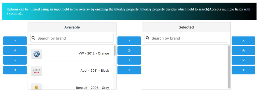
For example, PickList and OrderList components brings the multi filter and drag & drop support across the source and target lists.
The filter feature is enabled by filterBy property and also enables multi field filtering by comma separated values.
<p-pickList [source]="sourceCars" [target]="targetCars" sourceHeader="Available" targetHeader="Selected"
            dragdrop="true"
            [responsive]="true" filterBy="brand"
            sourceFilterPlaceholder="Search by brand" targetFilterPlaceholder="Search by brand">
  <ng-template let-car pTemplate="item">
    <div class="ui-helper-clearfix">
      <img src="assets/showcase/images/demo/car/{{car.brand}}.png"
           style="display:inline-block;margin:2px 0 2px 2px"
           width="48">
      <div style="font-size:14px;float:right;margin:15px 5px 0 0">{{car.brand}} - {{car.year}} - {{car.color}}
      </div>
    </div>
  </ng-template>
</p-pickList>
This feature enables flexible filter on both source and target lists which appears as mentioned in the snapshot:
What about Defect fixes ?
The Github issue tracker has been reviewed completely and fixed many defects across the components. Now the issue tracker issues count reduced from 800 to 300 issues.
The complete change log is available here
What about Performance and accessibility Improvements ?
As a regular process of improving the performance across components, this release brings more improvements on DataTable component. The selection process is uniquely identified using dataKey and compareSelectionBy properties. This makes a big difference in performance optimization category when dealing with huge datasets having no pagination.
The form components such as InputSwitch and Dropdown improved for screen readers support.Apart form these changes, menu components and overlays improved with animations and responsive behaviour.
PrimeNG Book: A complete guide for Angular UI development
The complete guide on Angular UI development powered by Angular 4.x and PrimNG 4.x libraries is available for pre-order now. The book is written by myself and my friend Oleg Varaksin over the past few months. The book covers Angular specific concepts and PrimeNG components in detail. There are over 70 projects to cover all the concepts.
The book is available from PACKT’s publisher here and the Github link is available here
Conclusion:
It is time for Angular and PrimeNG developers to look into the next big release from PrimeNG. This release not only improve your UI but also improves the application performance and accessibility. Both blog and Github examples will be updated further after 4.1 release.